迷彩通常意味著與周圍環境協調一致。在一個世紀之前,戰艦想躲避潛艇時不會用這一招,因為在不斷變幻的海天背景之下,船首波與主煙囪會時刻暴露出戰艦的位置。於是炫幻迷彩應運而生,這種迷彩由彎彎曲曲的線條和五顏六色的花紋,以很抽象的方式顯示出來。採用炫幻迷彩的戰艦不難定位,難的是在程序繁瑣的攔截中,發射魚雷之前需要潛望鏡操作手迅速判斷出戰艦的航速與航向。也就是說,設計炫幻迷彩的目的就是造成誤判,有證據表明這種策略確實有效。
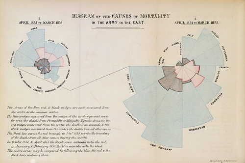
現在讓我們討論一下數據可視化,這是數字導向新聞報導中近來最炙手可熱的操作手法,不過這也讓我們想起弗洛倫斯•南丁格爾(Florence Nightingale)這樣的人物。她不僅是史上最著名的護士,而且是最漂亮的可視化技術“雞冠花圖”(Coxcomb diagram)的創始人。另外,她還是首位當選英國皇家統計學會(Royal Statistical Society)的女性會員。
數據可視化用複雜數據生成強大而精美的圖像。它就像行文技巧一樣:它能帶來舒適的體驗,如果應用得當,能成為一種發揮積極作用的武器;但另一面,它充滿誘惑,並可能具有欺騙性。我們對於數據可視化的經驗少於在修辭方面的經驗,在這方面還處於懵懂狀態,很容易可視化沖昏頭腦。數據可視化被等同於統計版炫幻迷彩的情形太多了——富有衝擊力的形象吸引了我們的注意力,而這要么不能傳遞有用信息,要么會在很大程度上誤導我們。
舉一個危害相對不大的例子,比如《紐約客》(The New Yorker)最近上線的地鐵不平等在線地圖。文中說:“紐約有不平等問題。”接著該文請我們點擊不同的地鐵地圖,這會讓我們看到一幅截面圖,截面圖顯示出沿著不同地鐵線路乘客收入中位數分佈的波峰和波谷。這一結果看上去十分漂亮,但是它所提供的信息遠遠比不上一幅地圖本來能提供的信息量。這其實是一件打著統計分析幌子的藝術品。
更有名的例子,是戴維•麥坎德利斯(David McCandless)令人印象深刻的動畫“債務方塊(Detris)”。在這個動畫中,巨大的方塊緩緩落下。為了向那個令人上癮的電腦遊戲“俄羅斯方塊”(Tetris)致敬,背景音樂採用了8位音軌。這些方塊的大小表示相應的美元金額。在“600億美元:2003年伊拉克戰爭耗費成本估值”的方塊之後,隨之而來的是“3萬億美元:伊拉克戰爭總成本估值”。在這之後則是沃爾瑪(Walmart)營收、聯合國(UN)預算、金融危機成本以及許多其他項目。
這一動畫純粹是一種炫幻迷彩。這完全把統計學的蘋果和統計學的桔子放在一起進行了比較。例如,與伊拉克戰爭有關的比較並不是第一眼看上去的那種“過去和現在的比較”,而是美國國防部(DoD)曾經估計的可能花銷與一種涵蓋因素更多的宏觀估值的比較,後者包括了死亡戰士生命的在財務估值,另外還包括了一萬億美元的“宏觀經濟損失”。伊拉克戰爭確實是一場災難,但完全沒必要為了證明這一觀點而在統計上採取調包手法。
麥坎德利斯告訴我們,信息可以是十分美妙的。不幸的是,誤導性信息也可能同樣美妙。或者,正如統計大師麥克•布拉斯特蘭德(Michael Blastland)所說:“我們很有可能會犯下與過去常犯的統計錯誤一樣的錯誤,只是表現形式更漂亮一些。”
那些漂亮的雞冠花圖也不例外。它們確實展示了克里米亞戰爭(Crimean war)中人員大量致死的原因,並且無可辯駁地證明了改善衛生條件能拯救人們的生命。但是南丁格爾傳記作家休•斯莫爾(Hugh Small)聲稱,南丁格爾選擇雞冠花圖的目的是為了專門證明以上觀點。實際上,簡單的直方圖原本能呈現得更清楚一些,但是就南丁格爾的目的而言,直方圖的問題在於因果關係表現得太過清晰,因為讀者會從直方圖得出結論,冬天來臨與糟糕的衛生條件導致的死亡人數同樣多。南丁格爾展示數據的方式是極有控制力的。這樣的呈現方式不是為了傳遞信息,而是為了說服讀者。我們觀賞當代數據可視化圖案之時,應該銘記這一點。
譯者/簡易
http://understandinguncertainty.org/coxcombs
Nightingale's 'Coxcombs'

 Through
her work as a nurse in the Crimean War, Florence Nightingale was a
pioneer in establishing the importance of sanitation in hospitals. She
meticulously gathered data on relating death tolls in hospitals to
cleanliness, and, because of her novel methods of communicating this
data, she was also a pioneer in applied statistics. We explore the work
of Nightingale, and in particular focus on her use of certain graphs
which, following misreading of her work, are now commonly known as
'coxcombs'.
Through
her work as a nurse in the Crimean War, Florence Nightingale was a
pioneer in establishing the importance of sanitation in hospitals. She
meticulously gathered data on relating death tolls in hospitals to
cleanliness, and, because of her novel methods of communicating this
data, she was also a pioneer in applied statistics. We explore the work
of Nightingale, and in particular focus on her use of certain graphs
which, following misreading of her work, are now commonly known as
'coxcombs'.In March 1854 war broke out between France, Great Britain, Sardinia, and the Ottoman Empire on one side, and Russia on the other side. Most of the fighting in the war occurred on the Crimean Peninsula, in the south of Ukraine, but wounded British troops were shipped across the Black Sea to hospitals in Turkey. The sanitary conditions of these hospitals were awful, and many more people died from diseases than from wounds.
Florence Nightingale arrived in Turkey in October 1854 with a group of women to work as voluntary nurses in the hospitals. They were initially denied entry to the wards, and it was not until the hospitals had reached a critical state in March 1855 that Nightingale and her fellow nurses were allowed proper access to the patients.
Nightingale realised that soldiers were dying needlessly from malnutrition, poor sanitation, and lack of activity. She strove to improve living conditions for the wounded troops, and kept meticulous records of the death toll in the hospitals as evidence of the importance of patient welfare.
After the war, Nightingale returned to Great Britain and continued to fight for better conditions in hospitals. She created graphs, which are often described as roses or coxcombs (although she did not refer to them as such), to highlight the death toll from diseases above the death toll from wounds in the Crimean War. One of her original graphs is shown in the following image.
Nightingale's coxcombs
沒有留言:
張貼留言